One neat thing about living in the Netherlands is the train infrastructure. It is absolutely top tier, and if you don’t agree with that statement right now, then I can almost guarantee you will by the end of this article, and while I too have a few gripes with it (mostly stemming from the fact that public transport in the Netherlands is privatized), the one thing I always praise about it is its connectedness (as it turns out, it’s actually not that connected at all, but I won’t spoil too much now).
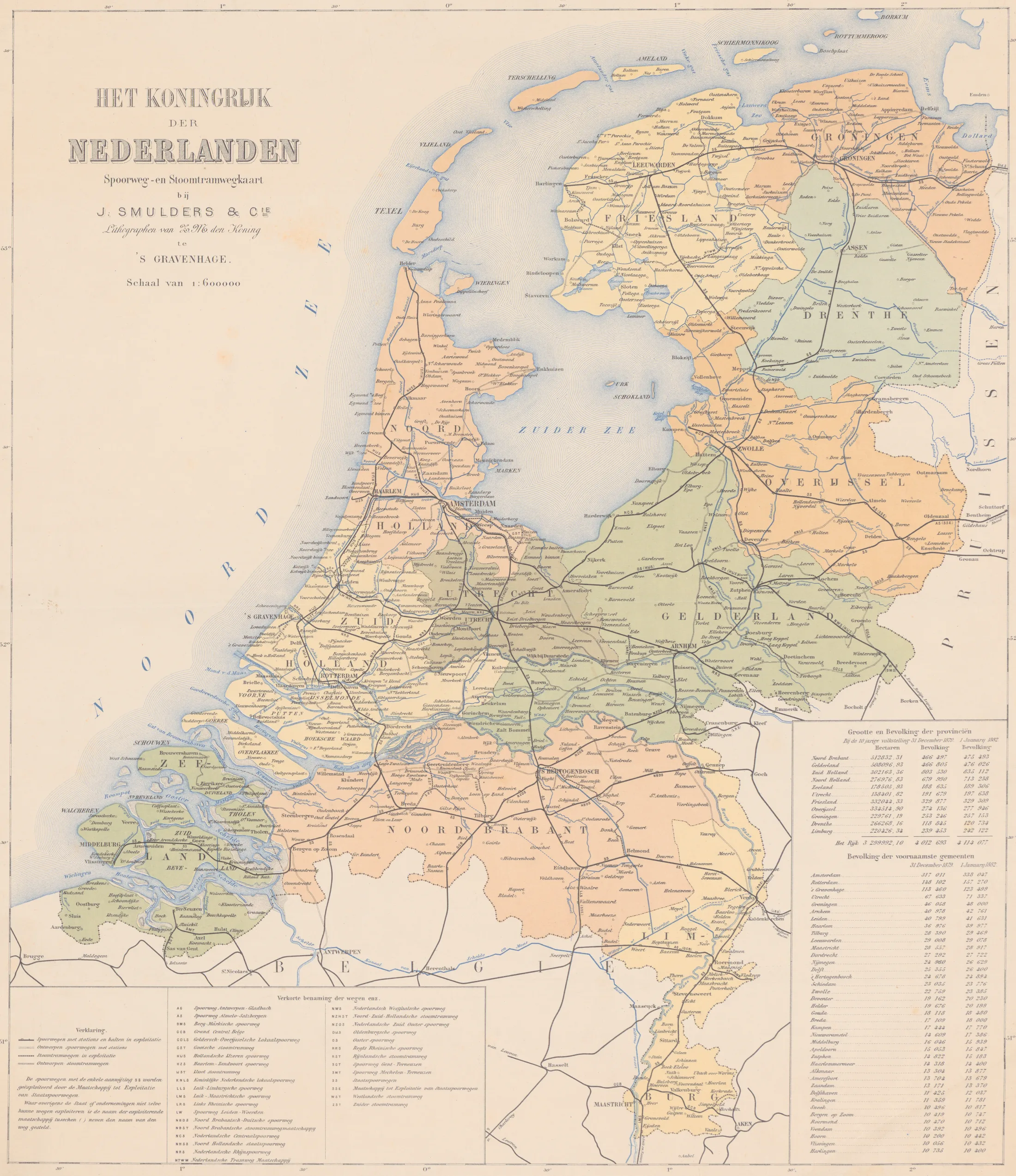
“Het Koningrijk der Nederlanden Spoorweg- en Stoomtramwegkaart,” lithographed by J. Smulders & Cie for the King. Source: archieven.nl.
To get started, I want to acknowledge that for any real system there likely exists a theoretically better alternative, but the degree to which a theoretical model is better is also directly proportional to how disconnected it is from reality.
To my surprise, when I searched for a theoretically better map of the Dutch railway system I found… Nothing. This honestly kind of surprised me, there is a large overlap between the kind of people who would get a dopamine hit from seeing a theoretically optimized railway system, and the kind of people that have barely enough technical knowledge to dare to make a model like that a reality. At least, I was under the assumption there would be a large overlap.
If you spend some time thinking about it, modeling a railway system is an incredibly complicated ordeal. There are many things to consider, such as terrain, capacity planning, budgeting, tourism, the intricacies of business-centric cities and student-centric cities, the list goes on and on, and the people that think about these things usually have years of schooling and experience to properly do them, and it is for precisely this reason that I did not spend a lot of time thinking about it and just got to building.
[i] Info
This blog post heavily simplifies many important parts of the actual rail network. I’m building an imaginary rail network from scratch, unlike a real railway network designer who has to take into account things like which companies own which parts of the rail and how all those rails will be maintained and connected. Later I also use a heavily simplified statistical model of how many people in which cities need to go where.
For this imaginary model I’m trying to optimize for two things that pull against each other: a minimal total amount of track, and shortest average trip for passengers, measured both in kilometers traveled and in the number of stations passed along the way. Less track means less to build and maintain, but it also means longer detours, and most of this article is me trying to find where the sweet spot between the two is.
The first step in trying to build any statistical model is cherry picking acquiring the appropriate foundational statistics.
The sources of my railway data will be the railway stations dataset, which contains all the stations and their geographical data, the station distances dataset, which contains the fare price matrix between stations (more on that in a bit). Unfortunately, this data doesn’t include information on which stations are actually connected to each other, so I had to do a bit of guessing.
A very simplistic visualization of this can be made with Python. A simple script cleans the public CSVs, exports the chart data, and this interactive view renders the station connections in the browser.

Now, any astute reader who is familiar with the Dutch railway system will probably look at that map and see that it’s kind of wrong. The data for the above map is drawn using the fare-price matrix from NS which they use to calculate the fare (cost of traveling) from point A to B, but for quite a few of these stations traveling from A to B is technically possible, but it’s sometimes not a direct connection, and you would need to change train lines partway through your journey.
Trying a few ways of making the data make sense
My original pass at cleaning up and enriching the data to make a cohesive map consisted of connecting each station to its 3 cheapest-fare neighbors, but even if “nearest by price” sounded like a reasonable stand-in for “nearest by track” seeing as how price goes up with distance, it really wasn’t, and not by quite a wide margin.
To point out how wrong this model is, let’s have a look at a trip from Rotterdam Centraal to Den Haag Centraal, 20km apart in real life, and a direct 25-ish minute trip. In my “cheapest neighbor” model, this trip took 23 hops through the train network, which is to say the train would pass through 23 stations in total. The problem was that Rotterdam’s three cheapest fares coincidentally don’t include Den Haag, its largest neighboring city and one of the most well connected cities in the Netherlands, even though an ordinary (but slightly more expensive) fare exists between them. My followup fix at the time attempted to solve this by also connecting each major station to its four nearest other major stations by distance, which did fix the whole Rotterdam-Den Haag case, but that still left a whole lot of nonsensical and non-existent connections between densely concentrated stations.
One interesting quirk of this fare-distance nearest-neighbor graph is that it had also connected Vlissingen which is a dead-end branch-line station in Zeeland directly to Rotterdam Centraal, Delft, and Breda, three separate stations strung out along the exact same rail line back toward the rest of the network. None of them are actually adjacent to Vlissingen. Like, at all.
At that point, patching the heuristic a third time felt like the wrong move, so I did what any reasonable person would do and blamed my data. That led to the search for something that wouldn’t require me to make up my own connections between stations.
Luckily Rijden de Treinen’s train archive (which I had somehow completely missed before this) records every real stop of every real train service in the Netherlands. For any given service, every pair of consecutive stops is a pair of stations that train ran between without stopping. I pulled one representative month (about 1.9 million rows), counted how often each station pair showed up back-to-back, skipped the replacement buses that run instead of trains during engineering works, and dropped any pair that happened fewer than 25 times in the whole month (a result of things like diversions during track maintenance).
That got me 574 edges (or connections between stations). This naive graph still has an issue that needs addressing before I can actually run any optimizations on it though. An Intercity (fast train that only stops in big stations) from Amsterdam Centraal to Utrecht Centraal runs straight past a string of stations that the Sprinter (smaller train that stops more often at the smaller stations) on the same track stops at. So the graph was full of “express shortcuts” from Intercity train lines that skipped stations where the Sprinters would be going. A whopping 141 of these “express shortcuts” that add non-existent bypasses, so I guess that needs fixing too.
Luckily this fix didn’t need additional data. If some regular service stops at intermediate stations between A and B, along a path barely longer than the straight line from A to B (at most 25% longer), then that A–B hop is an express run (or intercity route) over that same rail. Why did I go for a 25% cutoff? Because I’m not a statistician and the vibe felt right.
What’s left is 433 station-to-next-station segments, plus one synthetic bridge for Heerenveen’s IJsstadion I added manually, it only operates during speed-skating events and had zero regular service in the sampled data. Most charts and numbers on the rest of this page are in reference to this network of 434 connections.
[~] What exactly is a “hop”
I’ll be using the terminology for a “hop” a lot in the rest of this article. Because the fare-price “shortcuts” are gone, every connection (or edge) is a stretch of track from one station (or node) to the next one along the line, and a “hop” means passing one station, whether the train on that line would be stopping or not. That makes hop counts a sort of decent measure of how “far” (along the network) a trip goes, but it’s not realistically equivalent to how many times you’d change trains or how long the ride takes. The model has no train types, timetables, or transfers. (Near the end I also count hops the way a traveler might, ignoring plain halts.)
Before throwing people onto our network, here are two quick representations of the data.
20 dead-end stations (exactly one connection)
Bad Nieuweschans, Delfzijl, Den Helder, Eemshaven, Eijsden, Emmen, Enkhuizen, Eygelshoven Mrkt, Glanerbrug, Harlingen Haven, IJsstadion, Kampen, Kerkrade C., Maliebaan, Oldenzaal, Rhenen, Stavoren, Veendam, Vlissingen, Zandvoort
Simulating how people use the trains
Unfortunately, I couldn’t find any statistics around the amount of people traveling in and out of every station. As far as I can tell this data is skirting close to being PII and not easily available to the public, so I had to do the next best thing: making it up, also called a Monte Carlo simulation.
The Monte Carlo simulation is based on the amount of people living in a city and all of their possible destinations. According to CBS, around 7.2% of people in the Netherlands use OV every day. As for where they’re going, the Monte Carlo simulation will bias bigger and closer cities to find the statistical “weight” between any two stations based on how often they are used.
For “how many people live near which station” I use CBS’s 100 meter by 100 meter population grid, which says how many people live in every 100 meter square of the country. I split each square’s residents across the stations within 5 km of it, weighting every station by one over its distance squared (anything closer than 500 meters counts as 500 meters), and people with no station within 5 km are counted nowhere. That covers about 13.4 million of the 17.2 million residents CBS publishes squares for, and I think it’s a lot better than guesstimating from a single point per municipality, though it’s still an estimate of where people live, not where they work, study, or change trains.
A lot of the complication in this comes from actually knowing what that aforementioned statistical weight should be. At first, I programmed this so the weights for origin and destination were both drawn by population alone, but that means a trip to a big city 200km away was exactly as likely as one to an equally big city next door, which becomes a problem when you have as many big cities as close to each other as the Netherlands does, and most of the population just sorta goes back and forth between their own city, and their neighboring big city. The first fix was a gravity model, where a destination’s pull is population / distance^power, with power being a variable tuned by real station usage data. This approach, coincidentally, went too far the other way, and 58% of simulated train trips went to the very next station, the median trip was 4.5km, and the average was under 20km. Comparing this to CBS’s travel survey, which says the average Dutch train trip is about 50km and almost none are shorter than 7.5km, shows the weights need some refining still.
An interesting thing I want to note here is that people generally do travel small distances of ~4.5km, but that’s usually by bike. First I changed the simulation to take distances below a floor and count them as if they were at the floor, which stops “the next town over” from any starting point almost always having more travelers as compared to a bigger city 20km away. Second, unless you’re one of these folks, people don’t travel to stations just for the sake of traveling, it’s usually for something around their destination station. A station’s catchment only counts the people who live nearby, which badly undercounts a megastation: the people nearest to Utrecht Centraal number about 51,000, and Strijp-S, a small station in a former factory district in Eindhoven, comes out with a bigger catchment than Eindhoven Centraal. Rijden de Treinen classifies every station by type, so hubs now get a multiplier that stacks per tier: a plain Intercity station counts for one tier, an Intercity junction for two, and a megastation (Amsterdam C., Utrecht C., Rotterdam C., etc.) for three, and every tier multiplies the station’s weight by the same factor.
Now I can take these three variables (distance power, distance floor, hub multiplier) and algorithmically fit them to two actual (real life) measurements, the distribution of Dutch train trip lengths from CBS’s travel survey (2022–2024), and any station’s share of real station usage from the list of the busiest stations. Because the model draws rails as the crow flies between stations geographical location, I come out with about 20% less track than what actually exists today (more on that at the end), and to offset this model distances get scaled up by that much before being compared.
| Old model | Fitted model | Real | |
|---|---|---|---|
| Trips < 7.5km | 60% | 7% | 3% |
| Trips > 50km | 10% | 37% | 42% |
| Average trip | 18km | 52km | 50km |
| Megastations’ share of station usage | 9% | 30% | 29% |
| Correlation with real station usage | 0.55 | 0.73 | N/A |
The algorithmic fitting results in a distance power of 3, a 25km floor, and a hub multiplier of 2.5 per tier, which makes a plain Intercity station weigh two and a half times as much as an ordinary stop, a junction about six times, and a megastation about sixteen times. With these variables, the new model’s busiest-stations ranking got substantially closer to the real one. Neato! Granted, the CBS distances are door to door (including the bike ride to the station), and real usage would also include transfers, which the model doesn’t have. But it’s no longer resulting in a country of one-stop commuters at least?
Coloring the map purely by the number of people in each station’s catchment gives:
[~] The bug that made Delft Campus the biggest station in the country
The first time I rendered this map, a minor suburban stop called Delft Campus was sitting there as the largest station in the Netherlands, with a modeled catchment of over 790,000 people (roughly 30 times its actual usage, and more than Amsterdam Centraal). It was interesting enough that I thought I’d write about it, unlike the countless other bugs I worked through to get here.
The culprit was a municipality’s administrative boundary not matching where its people and stations actually are. Rotterdam’s territory stretches about 30km west to the Hoek van Holland coastline, which drags its centroid so far from the city that none of Rotterdam’s own stations were close enough to count as candidates. My fallback for edge cases like this picked the single nearest station to that misplaced centroid, which turned out to be Delft Campus, and dumped the whole city on it.
I patched that twice (point a municipality at the stations named after it first, then split it across several nearby stations), but a whole city dropped on one station was really a sign that one point per municipality was the wrong idea to begin with. The population now comes from CBS’s 100 meter squares, so there is no centroid left to misplace, and Delft Campus has a catchment of about 54,000 people.
Using the data from the above, I can run the Monte Carlo simulation. I start with an empty map, then thicken and saturate one line for each simulated passenger route. The simulation stores aggregate counts per edge for efficiency.
Before I flatten all of that into a static aggregate, here’s a small demonstration of what’s being simulated. This is a slice of the simulation, each randomly selected passenger following their own shortest-fare-distance route. For the actual simulation I used 10,000,000 simulated travelers.
Zooming out from individual connections, here’s how that traffic is spread over the whole network.
Amsterdam C. – Sloterdijk
Busiest edge (1,245,070 passengers)
0
Edges with zero simulated traffic
118,786.5
Median passengers per edge
Summing that simulated passenger flow at each station gives a more direct answer to “which stations does this model actually think are busy”:
Throughput is a measurement of passengers passing through a station, not necessarily boarding at it, and on a network made of only station-to-station segments, that makes a rather large difference when compared to reality. Something interesting stands out here, seven of the simulation’s ten busiest stations sit on the single stretch of track between Den Haag and Rotterdam. Every simulated trip between Den Haag, Leiden, or Haarlem and Rotterdam or anywhere south of it takes that railway line, so its small stations “carry” all of that traffic as well, regardless of how often the trains stop there. Den Haag Moerwijk comes out 6th-busiest in the model, but in real life it doesn’t even make the top 150 at all.
| Station | Simulated rank (throughput only) | Actual rank |
|---|---|---|
| Rotterdam C. | #5 | #3 |
| Den Haag HS | #3 | #16 |
| Rijswijk | #7 | #62 |
| Delft | #8 | #18 |
| Schiedam C. | #10 | #31 |
| Delft Campus | #9 | #93 |
| Zwolle | #52 | #12 |
That result is not necessarily a flaw in the model, but rather in how I’m measuring things. In real life, a train from Den Haag to Rotterdam genuinely does run past Moerwijk and Rijswijk without anyone getting on or off, but since the simulation is measuring “throughput” it counts them anyway.
That’s also something I can check and correct for! The simulation knows where every trip starts and ends, so I can count only the trips where someone gets on or off at a station, which is the closest thing the model has to real boardings and alightings, and see how far off each way of counting lands from the real ranking:
Counted this way, the phantom busy stations mostly deflate. The model is far from perfect (it also thinks Alphen aan den Rijn is the 11th busiest station in the country, which I highly doubt), but “where trains pass” and “where people get off” turn out to be two very different rankings, as expected.
The same effect shows up when I compare each station’s traffic to what its catchment population alone would predict:
The odd one out in that table is Zwolle, which is a more interesting case.
[~] What’s up with Zwolle?
In real life, Zwolle is a sort of knooppunt station (nodal point, or rather, knot point station). Zwolle is pretty much the only station that connects the southern half of the Netherlands with the northern half. If you were to cut out the knot, the graph of the network would split into a 58-station graph which covers most of the north, and a 336-station graph which covers the rest of the country (plus a lonely two-station stub). As a consequence of this real life geography, in my earlier model every simulated trip between the north and the rest of the country had to pass through Zwolle. This resulted in it being one of the busiest stations in the country. Interestingly, in the revised model where nearer stations are preferable to the virtual travelers, it ended up dropping a significant amount, so much so that it’s much less busy in the mdoel than in real life.

A “knooppunt,” macro shot of a knot of black string between two glass pains. Part of my macro photos.
I think, in a way, a knooppunt like this says something about us. Zwolle exists as a knooppunt because few people travel between the far north and the south, so the network funnels the handful that do through a single point instead of building them a second alternate and expensive route. What I wonder is which is the chicken, and which is the egg? Maybe we build so little rail between those worlds and peoples far away from us because we have little in common with people outside our own local networks. Or maybe we have little in common because the rail infrastructure doesn’t make it easy to travel, and I can’t help but imagine if a country that was easier to cross would be one that knew its neighbors better, and that would make us want more connections to them. Anyway…
Actually optimizing for something
Earlier I said I wanted both a minimal total amount of track and short trips for passengers, and then spent a good while on connectivity, demand, and simulated flow without scoring either one. Time to fix that, starting with the crudest approach I could think of.
For every connection in the network I can compute two numbers I more or less already have: how many simulated passengers used it, and roughly how much track it costs to include (using the great-circle distance between its two stations as a stand-in for real track length, since fare distance is in reality just a price, and a “price” is only “a unit of length” if your mom asks me politely). Dividing the two gives an efficiency score for passengers carried per kilometer of track.
The above pruning rule is relatively straightforward, sort every connection from least to most efficient, and try removing each one in that order, keeping the removal only if the network stays fully connected afterward. Running it to completion, that cuts 38 of 434 connections (down to 396), dropping the modeled network from roughly 2,566km down to 2,068km, while keeping all remaining 397 stations technically reachable.
Hmm, that’s interesting. I have 396 connections now, and only 397 stations. It turns out that a connected network of 397 stations needs at least 396 connections, and a network with exactly that many has no loops at all. I just made a railway tree! (a tree is a specific type of graph) It’s also unexpected to me that the real life railway network seems to only have 38 “extra” connections between all of its hundreds of stations. That implies the real network is already almost a tree, and “remove anything you can without disconnecting a station” just ends up removing every loop, because every loop has at least one connection you can cut per definition. This is what I alluded to at the start of the post when I said the Dutch railway system is actually not that well connected at all.
Cutting away that much track for free would be a hollow victory if every trip suddenly took forever though (unless you REALLY didn’t want to maintain extra tracks). Averaged over every origin-destination pair in the demand model (weighted by how often the simulation makes that trip), the average trip grows from 41.0km to 64.0km, which is about 56% longer, on the pruned network.
[~] What happens when greedy pruning cuts a line people actually use?
My favorite casualty in this new graph is Dronten and Lelystad, which are physically 17km apart on the Hanzelijn, a real and regularly scheduled line, but greedy pruning cut it out, forcing a detour of 82 hops for anyone trying to get between them. From Zwolle through Apeldoorn, down to Arnhem and across Brabant, over to Rotterdam, and back up the coast through Den Haag, Leiden, Haarlem, Amsterdam, and Almere. Almost a lap of the country! That train line is just lightly used relative to its length, so a rule that only looks at each connection’s passengers-per-kilometer has no way to know if it’s structurally important for avoiding a huge detour. This shows the biggest issue with greedy algorithms (and in my opinion, any decision based in greed): a lack of foresight.
[!] Warning
A real railway network designer still can’t just delete a track that people are already relying on, which is exactly the kind of real-world constraint this whole post has been pointedly ignoring from the start. Don’t let any of these fancy graphs and big words fool you into thinking I actually know what I’m doing.
Can a smarter and more complicated algorithm beat the greedy pruning?
So to answer the question of what smarter and more complicated algorithm to use, I actually need to analyze our initial question a bit more. If I want the network with the least total track that still connects every station, as alluded to before, I’m looking for the minimum spanning tree. How do I find it? That actually already has a very simple, very efficient textbook algorithm (Kruskal’s) that finds the exact answer in a fraction of a second. But I’m not really writing this article because I want answers, I’m doing it because I’m having fun, so I’m changing my question to “if every loop you keep costs track and shortens some trips, how much track is a shorter trip worth?” and for that my friends, I’ll be using Simulated Annealing!
score = total track (km) + w * average trip (km)
[~] Why “simulated annealing”?
Because it’s cool. It’s genuinely one of my favorite class of optimization algorithms, even if it’s not often the best choice. The name comes from metalworking, but annealing is a method applied to other things too like pottery or glassblowing. When you cool hot metal, its atoms have time to settle into a strong, orderly structure, but cool it too fast and it “freezes” into a weaker, disorganized one. Simulated annealing borrows that idea for search problems. Think of it as feeling around a hilly, foggy landscape for the lowest (optimum) point, able to sense only the ground right under your feet. Always walking downhill can strand you at the bottom of a shallow dip that isn’t really lowest point anywhere nearby. Simulated annealing deliberately allows some uphill steps too (a lot at first, more reluctantly as a “temperature” cools over the course of the search), which gives the real chance to climb out of a possible shallow dip and find a deeper one.
For each weight, the search starts by building the minimum spanning tree, then hill-climbs by adding or removing whichever single connection lowers the score most, until nothing does. Only then does simulated annealing get a go, proposing random additions, removals, and swaps (add one connection, drop another from the loop it closes), followed by a few “tempering” rounds where heat is introduced into the simulation again and allowed to cool over time. Every network is scored against the entire demand model so the search can’t get lucky by overfitting to a handful of passengers.

w = 0 (no loops) up to w = 500. You can see the loops reappear as trip length starts to matter!At w = 50, the result keeps 412 connections, 16 loops above a bare tree. It spends 2,226km of track, 10% more than the minimum spanning tree’s 2,025km, and in return the average trip drops from 76.9km to 43.8km, which is around 43% shorter, within 3km of the full “real life” unpruned network’s 41.0km, on 13% less track.
| Network | Connections | Total track | Avg. trip | Avg. hops |
|---|---|---|---|---|
| Every real connection | 434 | 2,566km | 41.0km | 7.38 |
| Greedy pruning | 396 | 2,068km | 64.0km | 13.81 |
Minimum spanning tree (w = 0) | 396 | 2,025km | 76.9km | 17.29 |
Balanced (w = 50) | 412 | 2,226km | 43.8km | 8.74 |
What if I counted station hops instead of kilometers?
Kilometers don’t quite match up with how pleasant a train ride is, since every extra station passed is another chance for the ride to drag on. So for the second half of the experiment I capped the track budget at what the balanced network uses (2,226km) and minimized the average number of hops per trip instead.
I punched those numbers into my fancy calculator, and it didn’t find anything better. At the same budget the network with the fewest average hops is the balanced network itself, at 8.74 hops, and starting the search from a different network didn’t change that. In other words, the two goals agree: the network that keeps trips short in kilometers is also the one that keeps them short in stations. Giving it 10% more track (2,449km) does get it down to 7.58 hops, about 13% fewer.
See the difference for yourself
Aggregate percentages are easy to compute, but difficult for humans to comprehend. As a demonstration, here is the greedy pruning algorithm and the best balanced network side by side, with a button that spawns a random passenger from the simulation’s demand model and animates their route on both at once.
Greedy pruning (396 edges)
Balanced, w=50 (412 edges)
If you play around with that for a bit, you’ll notice that plenty of passengers won’t notice any difference. Of the 40 sampled trips, 29 take the same route on both networks.
How does the real railway network compare?
So far every comparison has been between networks that live inside my model, so here is how they stack up against the real connections. I routed the whole demand model across each network and measured three things per trip: how far you ride, how many stations you pass, and your detour (how much longer the ride is than a straight line between where you started and where you ended up). For each one I’m showing the median (the typical trip), the mean, and the 90th percentile (a bad day, where only 1 in 10 trips is worse).
The first thing that stands out is how little the median trip is changed. It’s 30km on the real network, 32km on the balanced one, and 39km on the bare spanning tree, because most trips are short and local, and even a tree covers those. The realy problems hide in the higher percentiles of our data. A 90th percentile trip is 85km on the real network and 93km on the balanced one, but 152km with greedy pruning and 205km on the spanning tree, with the stations passed ballooning from 15 to 33 and 49. Cutting track “for free” makes our passengers take a LOT of detours, which makes happiness go down.
The real Dutch railway network is about 3,223 route-km (6,830km once you count parallel tracks separately). The full model network comes out at 2,566km, about 20% under that, since my tracks are straight lines and the real track curves around rivers, towns, and property lines, so comparing like for like means scaling the model up to the real 3,223km. What the “balanced” network actually buys is 13% less track, in exchange for trips that are 3km longer on average.
What if I ignore the halts?
A reader pointed out that counting every station as a hop is a very mathematical way to look at a railway. Maarn, for example, doesn’t exist to connect Maarn to anything, it exists because the Utrecht to Arnhem line happens to run past it, and what a traveler experiences is going from knooppunt to knooppunt. So here are the numbers again, ignoring halts: stations with exactly two connections, which are just stops along a line. By that definition 309 of the 397 stations (78%) are halts on the real network. Ignoring them can’t change how many loops there are (dropping a stop never creates or destroys a loop, so the real network is still exactly 38 connections away from a tree), but it does change what a hop means. Here a hop only counts the junctions a trip passes through, plus one:
| Network | Halts | Loops above a tree | Avg. hops | Avg. junction hops |
|---|---|---|---|---|
| Every real connection | 309 | 38 | 7.38 | 2.84 |
| Greedy pruning | 288 | 0 | 13.81 | 3.82 |
| Minimum spanning tree | 293 | 0 | 17.29 | 4.52 |
Balanced (w = 50) | 306 | 16 | 8.74 | 2.85 |
By this measure the balanced network is almost exactly as good as the real one (2.85 against 2.84), and the trees are 35% and 59% worse, rather than the 87% and 134% that would result from counting every station. So the “not well connected at all” claim holds up on the stricter definition of loops, but counting halts did exaggerate how bad the detours are when I initially modeled this.
Which new connection would help the most?
Pruning asks which track I could do without. The inverse of that would be: starting from the real network, which new connection helps the most for the least extra track? I tried every possible link between two stations up to 60km apart that aren’t neighbors already (about 19,000 candidates), scored each by how much it shortens the average trip per kilometer of new track, added the best one, and repeated.
Eight links add 55km of track, 2.1% more, and shorten the average trip by 0.96km, 2.3%, so the real network is already close to the sweet spot. Most of the winners are short links between two lines that run side by side, like Kesteren to Rhenen across the Nederrijn (3km), Amsterdam Centraal to Amsterdam Zuid (5km), and Delft Campus to Rotterdam Centraal (10km). They work because they turn a long detour into a short hop for a lot of trips.
[!] Warning
The model draws new track as a straight line, so it happily connects Enkhuizen to Stavoren straight across the IJsselmeer. I’m sure it’s clear that building new tracks over large bodies of water is not exactly an easy sell in real life
In conclusion?
Alright, let’s wrap it up. The real network is already almost a tree, just 38 connections away from the cheapest thing that still reaches every station. Chasing that tree, whether by greedy pruning or the minimum spanning tree, saves 19% to 21% of the track, and the price is paid by a small (but not insignificant) amount of passengers that now suddenly have MUCH longer trips, between 1.8 and 2.4 times as long for the 90th percentile. The balanced network, where simulated annealing decides how much track a shorter trip is worth, keeps the bad trips within 7km of the real one and still saves 13% of track.
So my very idealistic, heavily simplified, “let’s ignore the bits that are inconvenient” model can shave about 13% off the actual real life railway, and not without inconveniencing a lot of people. I ignored capacity (a single track can only carry so many trains), redundancy for when a line is blocked, freight, and the fact that a real network wasn’t designed in one go but put together piece by piece over hundreds of years.
I set out to find a better railway than the real one, and found a slightly cheaper one that would be worse if it were realized. If that still doesn’t convince you that the railway infrastructure of the Netherlands is absolutely top tier, well, then maybe you should spend some time on the Deutsche Bahn.